In this article, you'll learn how to read the Reviews report in your dashboard. It shows how many customers your review requests reached, how many clicked through, and how your Google review count has moved since requests started, so you can tell at a glance whether the requests are paying off.
To open the Reviews report:
- In the dashboard menu, click Reports.
- Click Reviews.
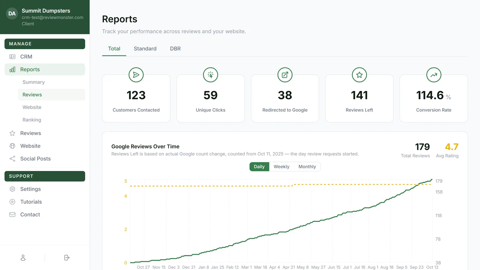
Switch between Total, Standard and DBR
Across the top of the report are three tabs:
- Total shows everything together.
- Standard shows only the requests that go out automatically after a job, the triggered ones.
- DBR shows only your Database Reactivation outreach, the requests sent to past customers.
Click a tab to switch. Here's what changes when you do:
- The cards: Total shows all five. Standard and DBR show three: Customers Contacted, Unique Clicks and Redirected to Google.
- The Google Reviews Over Time chart shows on Total and DBR, but not on Standard.
- The Recent Activity table lists only that tab's requests, and the Source column only appears on Total.
The cards
- Customers Contacted is how many people have been sent at least one review request.
- Unique Clicks is how many different people opened the link and tapped one of the rating faces.
- Redirected to Google is how many were sent on to your Google review page.
- Reviews Left is how much your Google review count has grown since review requests started.
- Conversion Rate is Reviews Left divided by Customers Contacted, as a percentage.
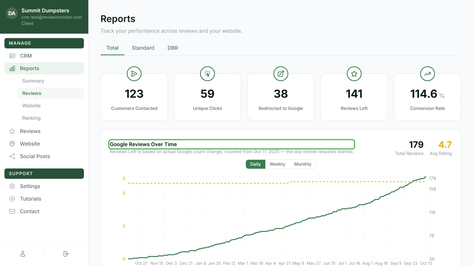
Google Reviews Over Time
This chart tracks your Google listing day by day. The green line is Total Reviews and the dashed gold line is Avg Rating (on a 0 to 5 scale, on the left). The two big numbers beside the title are your current total and current average.
The line under the title tells you the date the report counts from: the day your review requests started. Reviews you had before that day are your starting point, not something the report takes credit for.
Use Daily, Weekly and Monthly above the chart to change how it's grouped. Weekly and monthly show one point per week or month.
Recent Activity
At the bottom of the page is a table of people who opened a review link in roughly the last 90 days, newest first. Each row shows:
- Date: when they opened it.
- Contact: the customer's name, or a dash if we couldn't match one.
- Source: DBR or Triggered, so you can see which kind of request they came from. This column only shows on the Total tab.
- Rating: the face they picked, from happiest to unhappiest. Hover over it to see the word (Excellent, Good, Ok or Bad).
- Redirected: a green tick if they were sent on to Google.
Other charts on the page
Between the cards and the table you'll also find a 2-Week Pipeline of where recent contacts sit in the text and email sequence, a Requests Over Time chart, a Rating Breakdown, Clicks by Request, and Reviews Left by Day of Week. The Total tab adds a Lifetime Funnel, and the DBR tab shows a DBR Outreach Progress bar while that outreach is still working through your list.
Related articles
- Reports in your dashboard: an overview
- Tracking your review requests
- How review requests work
- Reactivating past customers with DBR
- Reading your weekly summary report