In this article, you'll learn how to read the Performance chart on your website report. It shows your Google traffic, your backlinks and your pages on one timeline, so you can see whether your site is growing and line that up with what changed.
To open the Performance chart:
- In the menu, click Reports.
- Under Reports, click Website.
- If you have microsites, click the site you want in the row of site buttons at the top. Your main site comes first.
- Scroll past Visitors to the Performance card.
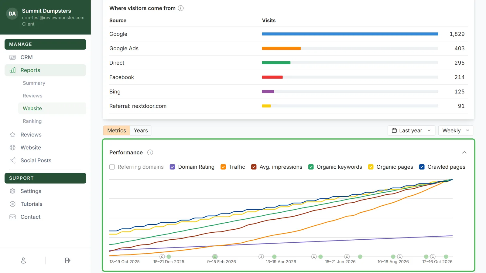
What the seven lines mean
Every line has a coloured checkbox above the chart:
- Referring domains: how many other websites link to yours. It's unchecked when the page opens.
- Domain Rating: an estimate of how strong your site's backlinks are, on a scale of 0 to 100.
- Traffic: clicks from Google search, straight from Google Search Console. In weekly view it's averaged over four weeks, so the line is smoother than the raw count.
- Avg. impressions: how often your site showed up in Google results, averaged the same way.
- Organic keywords: how many searches your site shows up for.
- Organic pages: pages on your site that show up in Google.
- Crawled pages: every page on your site, counted from its sitemap.
Traffic and impressions are Google's own numbers. Everything else is an estimate, read once a week. Each line has its own scale so they all fit on one chart, so the hover card is where you read the actual numbers.
Turning lines on and off
- Click a checkbox in the strip above the chart to hide that line.
- Click it again to bring the line back.
A filled box means the line is showing. A white box means it's hidden.
Reading a point with the hover card
Move your mouse across the chart. A thin line and a dot on each visible line follow you, and a card shows the dates for that week or month with every line's value.
The hover is shared across the whole page. The same week lights up on Organic positions, SERP features and the other charts below too, so you can compare them at a glance.
The G markers and the green dots
Markers sit along the bottom edge of the chart.
- G marks a Google ranking update. Hover it to see the date, the update's name, a plain explanation of what that kind of update does, and a Learn more link to Google's note. If more than one update landed in the same period, the marker shows a number and the card lists them all.
- Green dots mark changes made to your site. The bigger and darker the dot, the more of the site changed. Hover a dot to see the date and the size of the change (Minor changes, Moderate changes, Major changes or Overhaul changes), then click View changes to open the full list.
The dashed tail at the end
Traffic and impressions are added up day by day, so a week or month that's still going would read low. The chart projects those two lines to the full period instead. That's what you have in so far, plus what a normal rest of the period adds based on your last few weeks or months. The projected part is drawn as a dashed line, and the hover card says projected.
Because Google reports a few days late, the week before the current one can be projected too. The estimate settles onto the real total as the period fills in. Domain Rating, keywords and pages are never projected.
Comparing years with Years mode
- Above the cards, click Years.
- Next to the Performance title, open the menu and pick what to compare: Organic traffic, Impressions, Referring domains, Domain Rating, Organic pages, Organic keywords or Crawled pages.
- Use the Daily / Monthly menu at the top right to choose how fine the line is.
- Tick or untick the years in the checkbox strip to choose which ones are drawn, each in its own colour.
Each year is laid over the same January to December axis, so you can see whether this spring beat last spring. In Monthly, the month you're in is projected the same way and drawn dashed.
To go back to the seven lines, click Metrics.
Related articles
- Reading the Website report
- Reports in your dashboard: an overview
- Understanding your microsites
- Website overview