In this article, you'll learn what each section in the + Add a section picker does, and how to add, style, move and remove sections on a page of your website. Every page on your site is a stack of sections. Once you know what's in the picker, you can build a page that says what you want.
To open a page's sections:
- In the dashboard menu, click Website.
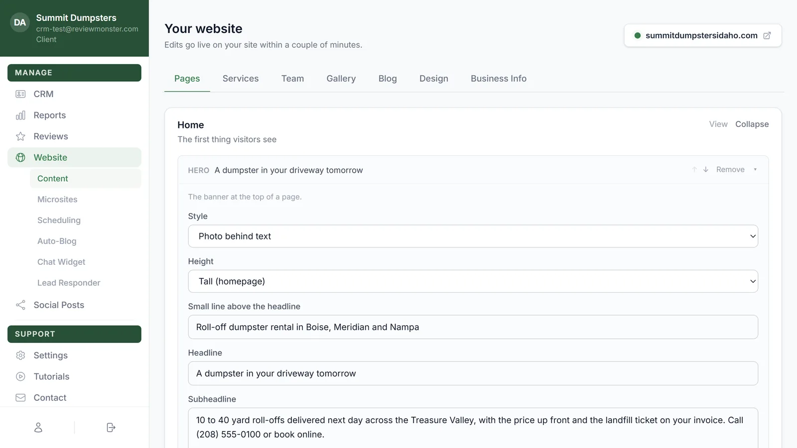
- The Pages tab opens first. Your home page is already open. For any other page, find it in the list and click Edit.
Add a section
- Scroll to the bottom of the page's sections and click + Add a section.
- Pick a section from the list. Each card shows the section's name and a short line about what it does.
- The new section lands at the bottom of the page. Click its name to open it, then fill it in.
- Click Save changes.
If you change your mind before you pick one, click Cancel.
Note: Adding a photo to a section you just added saves the page first, so the photo has somewhere to go.
Style, move and remove sections
- Click a section's name, or the small arrow on the right, to open or close it.
- Click ↑ or ↓ to move a section up or down the page.
- Click Remove to take a section off the page.
- Sections with more than one look have a Style menu at the top, like Photo cards, Simple list or Compact tiles for Services.
- Sections with a list (questions, coupons, pairs of photos) have their own add button, like + Add question. Each item in the list has its own ↑, ↓ and Remove.
Your live site doesn't change until you click Save changes. After that, edits show on your site within a couple of minutes.
Note: Some pages show a section marked Original section. That's a part of your site kept exactly as it was built. You can move it or remove it here, but its words are changed on request.
Note: If a page says it's shown as the sections it currently renders, save it once and its sections stay editable from then on.
Sections that fill themselves in
These sections pull from other places on your site, so you mostly set a heading and they handle the rest. Keep those places up to date and the section updates with them.
- Services: a card for each service on your Services tab, as photo cards, a simple list or compact tiles. You can add a call button under the cards.
- Team: the people on your Team tab.
- Photo gallery: photos from your Gallery tab, as a grid with captions, a masonry wall or a scrolling strip. You can show one category only, or limit how many show.
- Latest posts: your newest posts from the Blog tab.
- Google reviews: your live Google rating and newest reviews, as paged cards, a rating band or cards only. Until Google has reviews, it can show your saved testimonials instead.
- Reviews: saved quotes from your customers, three across, in a scrolling row or as one big quote.
- Trust bar: a thin strip of badges with your live Google rating in the middle. You can turn the rating off.
- Areas we serve: a card or chip for each city your site serves.
- Service-area band: a colored band listing every city your site serves, with a photo and a button to the full list.
- Find us: your address, phone, email, hours and service areas from Business Info, with or without a Google map.
- Contact form + details: your phone, email, address and hours beside a message form.
- Sub-page links: cards linking to the pages under this one. Turn off List sub-pages automatically to add your own links instead.
Sections you write yourself
- Hero: the banner at the top of a page, with a headline, photo and up to two buttons. Eight looks to pick from, and a Height setting.
- Quote bar: a get-a-quote band where visitors leave a name, phone, message and photos. You can set the tagline and button text, or start it minimized.
- Text + photo: a heading and paragraphs with an optional photo beside them, in a narrow column or on a dark band.
- Text: plain paragraphs in a readable column. Good for longer pages.
- Feature list: short points with a title and a line each, as cards, a checklist or numbered steps.
- Numbers: a row of big numbers, like years in business.
- FAQ: questions and answers, either click-to-open or all open.
- Before & after: before and after photos, as a drag-to-compare slider or pairs side by side.
- Pricing: packages or price tiers, with one you can highlight.
- Load-size pricing slider: visitors drag across load sizes to see what fits and a typical price.
- Instant quote: a three-step price estimator that shows a range and asks for a name and number to lock it in.
- Coupons: coupon cards with an amount, what it's for, the fine print and a button.
- Benefits + photo: a checklist of benefits, a price line and buttons beside a photo. Handy for a membership or maintenance plan.
- Link cards: a row of cards that each link somewhere, with or without photos.
- Call to action: a strong prompt to call or get a quote, as a rounded card, a full-width band or just a button.
- Call / quote / contact buttons: three quiet buttons in a row. Under Which button you can show all three or just one.
- Request service form: the message form on its own, with a heading.
- Embed: a map, video or booking widget from another site, using its embed address and a height in pixels.
Tip: Leads from the Quote bar and Instant quote go to the people on your Notifications page, under Settings in the menu.